Infocards
Infocards are discrete pieces of information about a resource. When grouped together in certain ways, they constitute a particular use case. We have assembled some common use cases for you under the Use Cases menu, but you can also create your own groupings with saved searches.
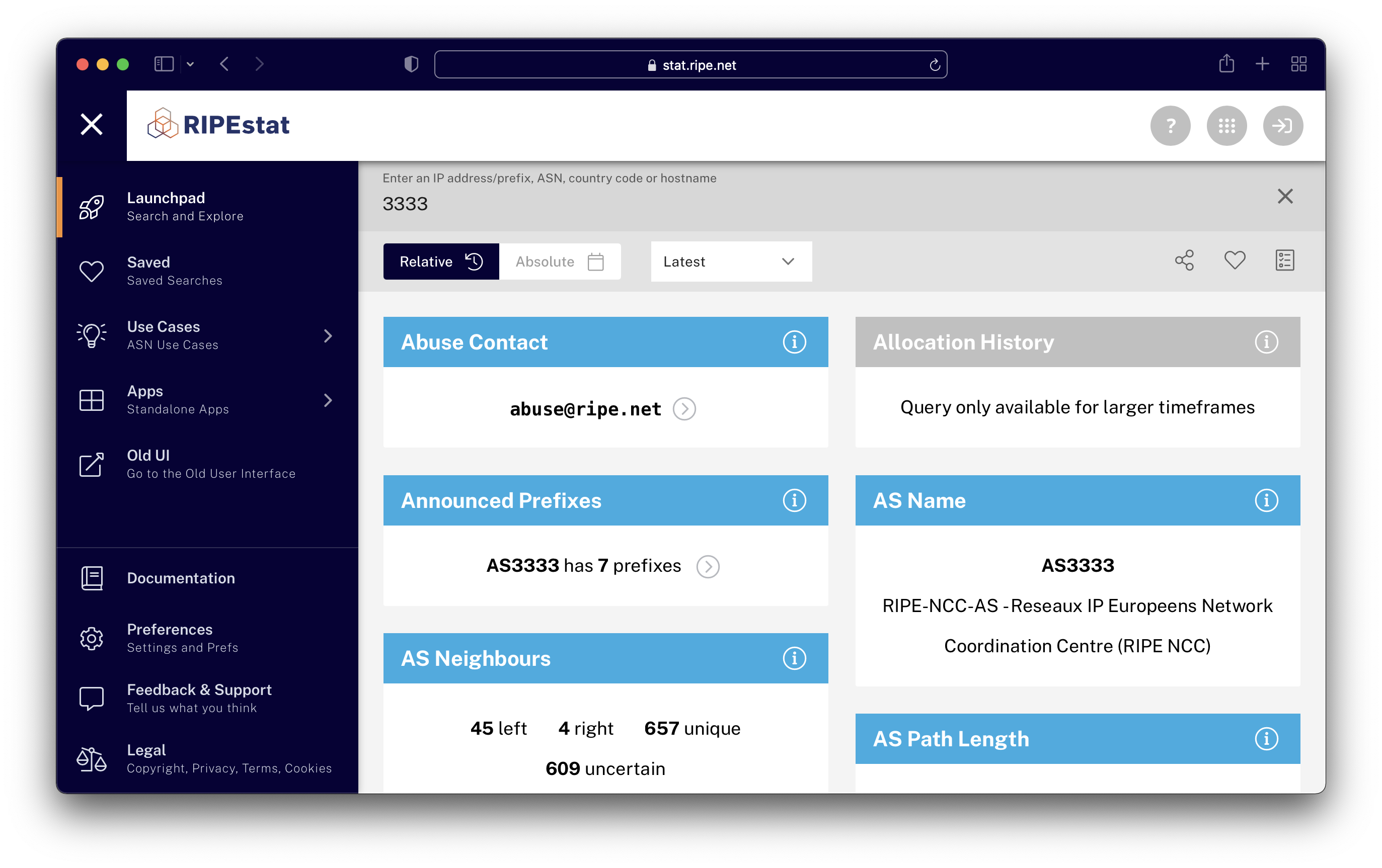
Anatomy of an Infocard
Each infocard consists of a titlebar and a content area. The titlebar contains the title as well as close button (on hover) and info button.
Titlebar
You can use the titlebar to:
- Drag the infocard to another location relative to its sibling cards
- Display or hide info about the card and its data
- Show or hide (expand/contract) more information of the card (if any)
- Hide the card (when hovering, an "x" will appear that when clicked on will hide the infocard)
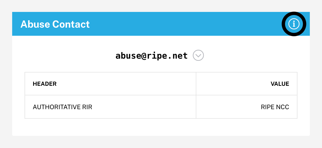
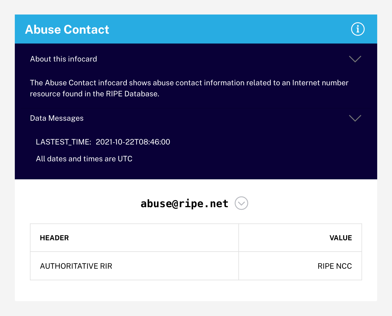
Content area
The main content area will generally show a short summary line about the queried resource. If there is more detailed information, it can be revealed by clicking the expand button in the titlebar.